
iOS App Feature Integration
Allowing riders in NYC to use the popular bikeshare app beyond point-to-point trips by discovering wellness and recreational activities to cycle to.
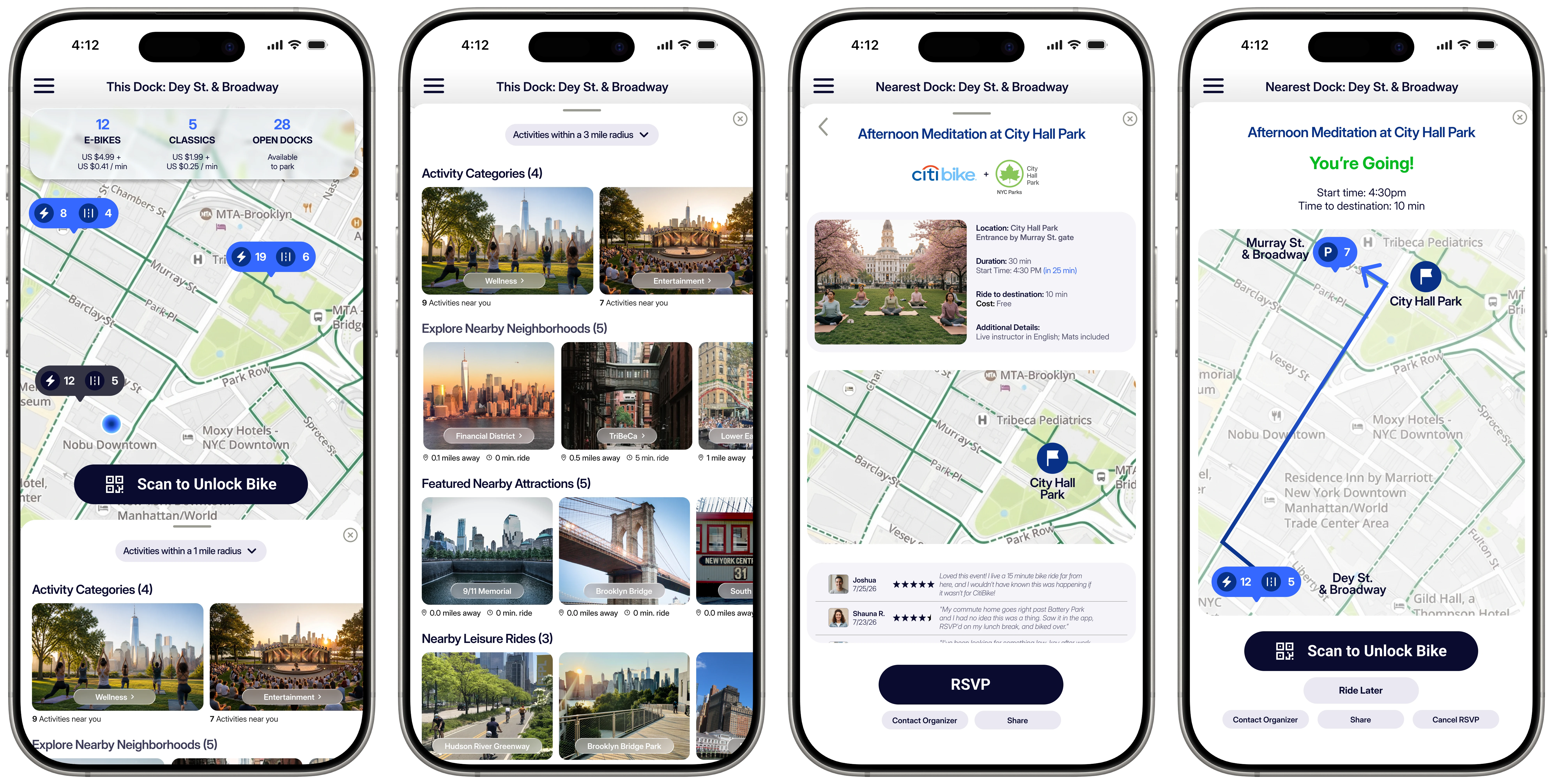
Citi Bike in New York City is the US’s largest bike share program, with over 27,000 bikes and over 1,700 stations. Members typically use Citi Bike to get from A to B, with access to classic and electric bikes. Powered by Lyft, it serves close to 2 million people throughout Manhattan, Brooklyn, Queens, The Bronx, Jersey City, and Hoboken.
As Project Manager and UX/UI Designer, I worked through a three-week team-based sprint followed by a three-week solo pivot.
The Challenge
Rather than starting with a company, we started with a gap:
After a competitive analysis on similar apps (Strava, Apple Fitness, etc.), we found Citi Bike a great city-specific app to add a social, goal-driven layer.
Improving Citi Bike’s Value Proposition

Expanding the stakeholder pool
(Event organizers, small businesses, non-profits, community partners)

Growing ridership & connections
(More users + more miles + more ways to meet people)

A happier, healthier NYC
The Research
User interviews and affinity mapping surfaced patterns in how people approach fitness and wellness, and where existing tools fall short. Highlights below include:

“I definitely prefer a wellness routine where activities aren’t repeated too much. Having variety is nice.”

“I don’t want to lose my progress.”

“I would love to be able to find new workout partners because it’s currently difficult to do so in the city, especially as a new transplant.”
We saw an opportunity to build social features that reinforced existing individual motivation (tracking progress; working toward personal milestones) to make personal goals easier to sustain with occasional social support within their app usage, like finding workout partners in a city this size.
Target Audience

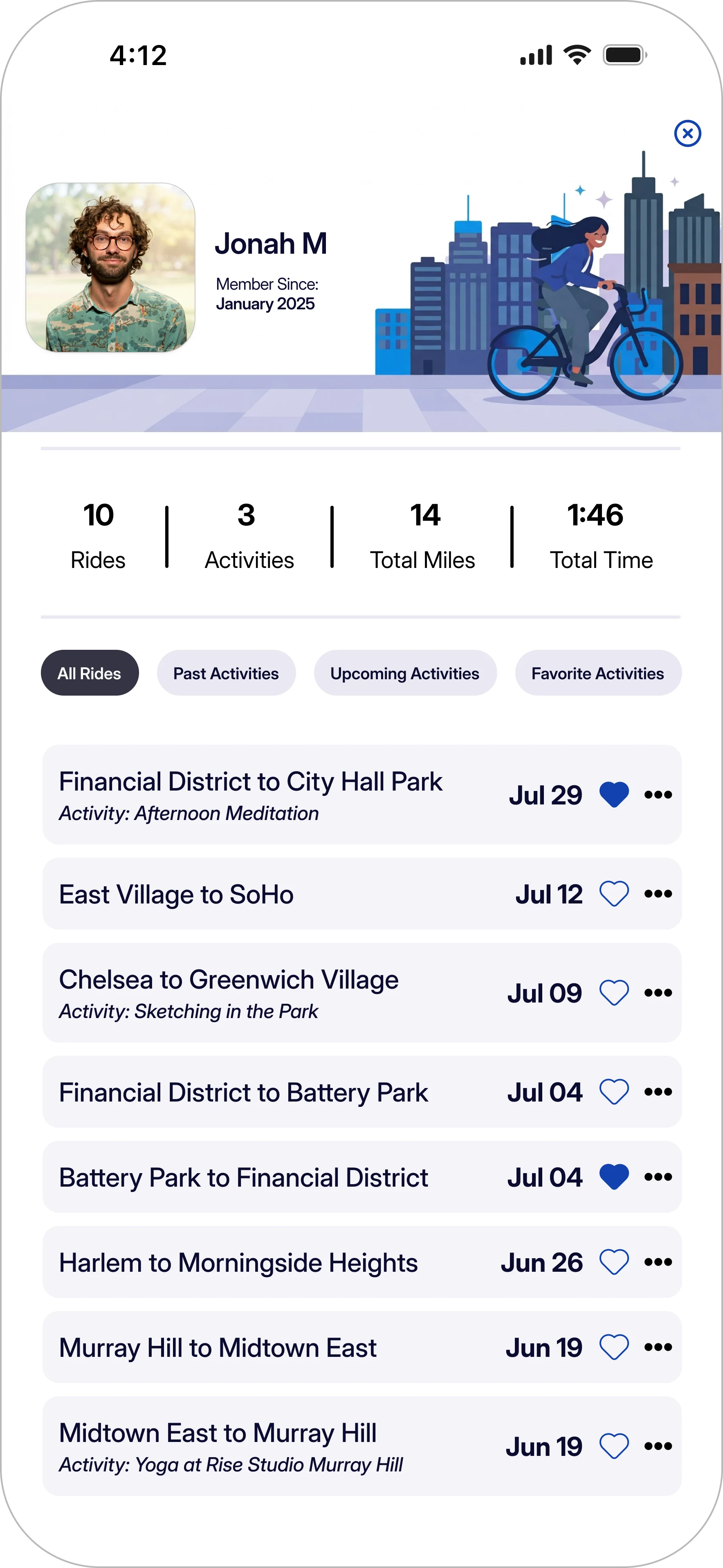
Jonah M.
31; Brooklyn, New York
Freelance Graphic Designer
Jonah loves switching up his fitness and wellness routines around the city, but struggles to stay motivated when sticking to any single one. He enjoys exercising with others but usually defaults to working out alone because finding partners in the city is harder than it should be.
What drives him: Variety, visible progress, and affordable options. He’s more engaged when activities feel casual and social rather than structured or competitive.
What frustrates him: Keeping a consistent routine week to week, the cost barrier to trying new things, and not knowing where to start when planning a wellness goal.
How might we help Jonah…
With this direction, we initially scoped a broad feature set to test our assumptions across four motivation types:

Discover
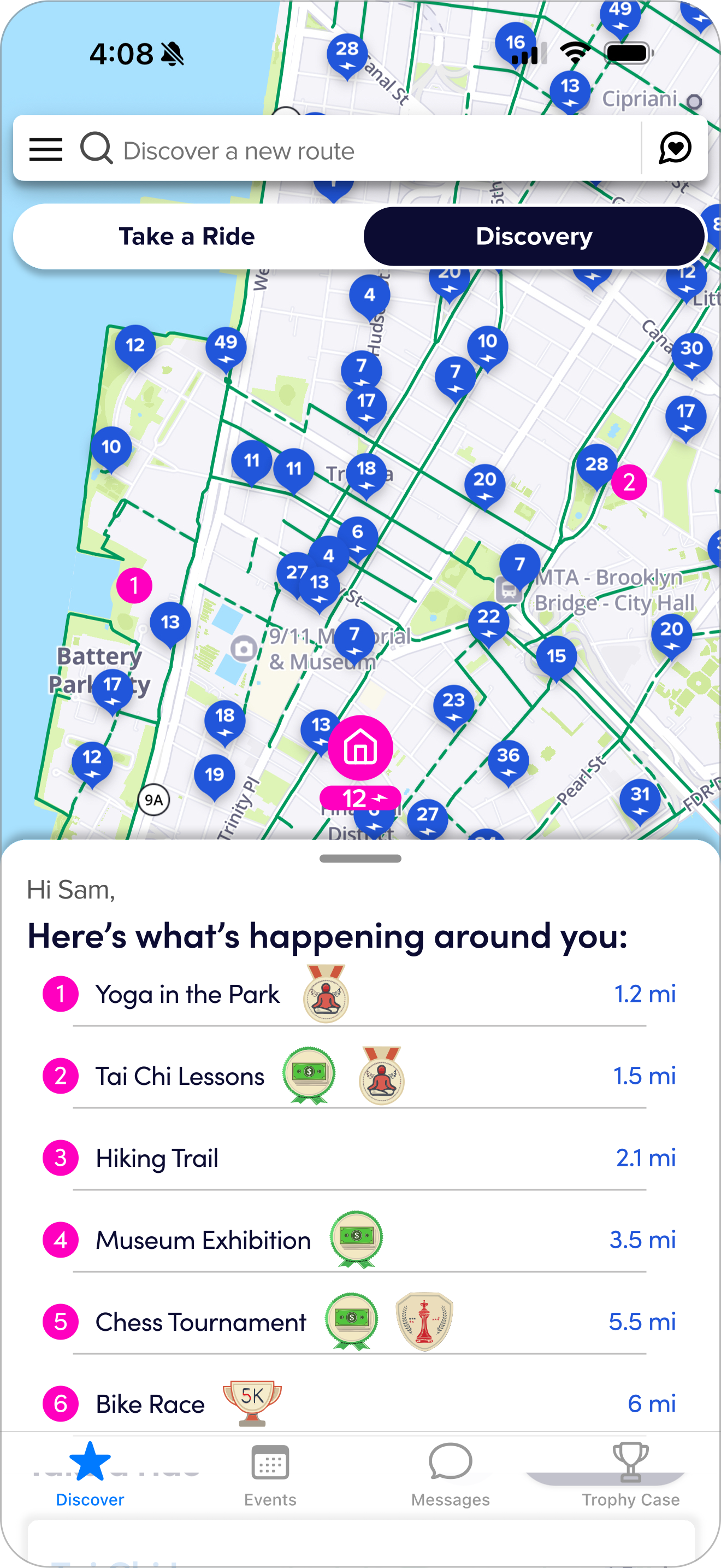
Discover nearby events to rsvp and ride to directly from within the app

Meet
Chat with other like-minded locals to meet up with at events, and even ride along with them

Track
Track progress and achievements through earning personal badges

Earn
Earn and claim rewards tied to local business through riding progress and achievements
The Design - Version 1
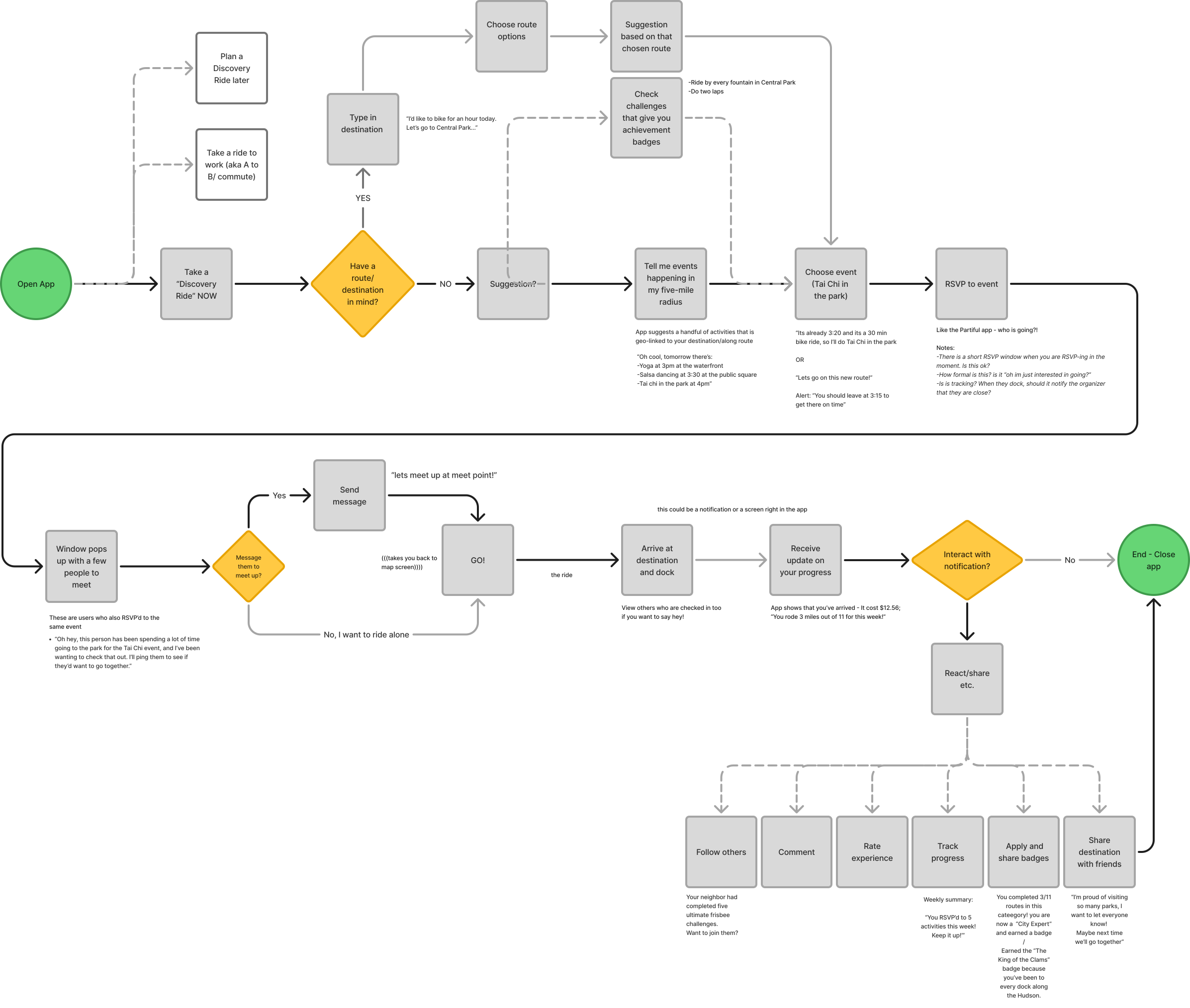
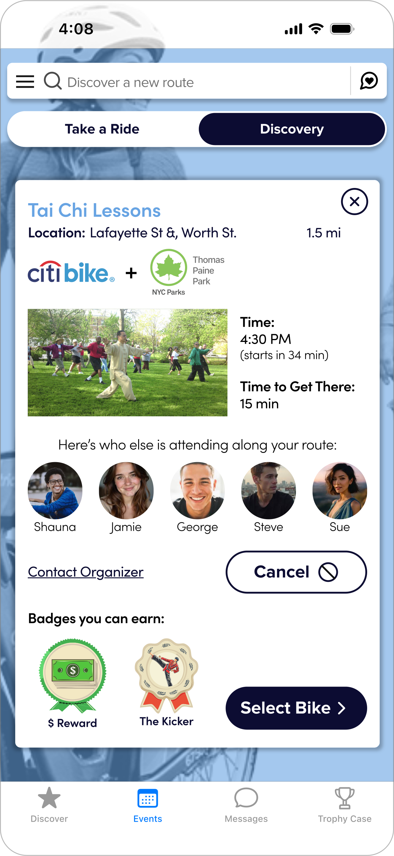
The user flow below was mapped out prior to building the first version of the feature set. Every possible interaction path was covered across all four features: browsing nearby events on a map, tapping into event details to see attendees and earnable badges, and messaging other riders attending the same activity. It was ambitious in hindsight for a first pass.
Below are three screens that capture the breadth of what we built:
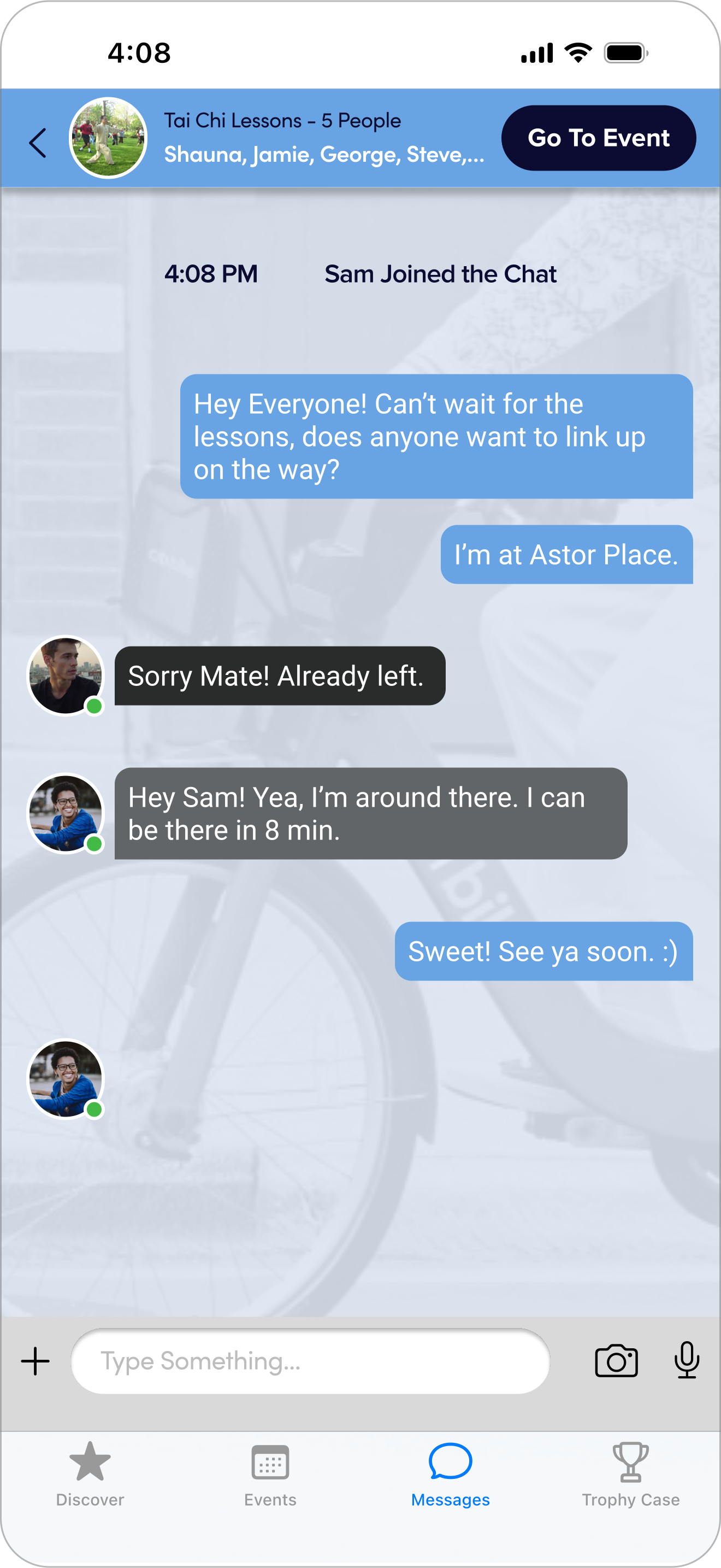
The hi-fi prototype was tested with five users across five metrics. Results were mostly positive at the screen level where individual interactions worked where users could navigate the flow and complete tasks.
| Metric | User 1 | User 2 | User 3 | User 4 | User 5 | Mid-fi avg | Hi-fi avg |
|---|---|---|---|---|---|---|---|
| Time on taskRSVP, Message, Add Badge | 3:10 | 4:27 | 3:41 | 8:17 | 3:02 | 4:50 | 4:40▲ |
| Ease of use | 4/5 | 5/5 | 4/5 | 4/5 | 5/5 | 3.75 | 4.5▲ |
| Excitement | 3/5 | 5/5 | 2/5 | 3/5 | 5/5 | 4 | 3.6▼ |
| Unobtrusiveness | 5/5 | 5/5 | 5/5 | 5/5 | 5/5 | 3.25 | 5▲ |
| Retention | 4/5 | 5/5 | 5/5 | 4/5 | 4/5 | 4.25 | 4.4▲ |
The Pivot: A Narrower Focus + UI Update
The team’s work ended here. While the individual screens tested well, I realized after some time that the system as a whole was too complex to integrate into an existing product without adding friction for users—especially in the early phases of testing and concept validation studies. I then decided to refine the integration further.
I took the findings forward solo and defined the MVP along with a new design system. Instead of a multi-feature wellness + social integration, the real opportunity was giving users a single, clear reason to open Citi Bike beyond an A-to-B commute.
Broad feature ecosystem
- Discover
- Meet
- Track
- Earn

Focused activities hub
The stakeholder vision carried forward—still building toward expanding partnerships and growing ridership—but through a more focused execution. Users can also meet others at the events themselves if they wish. I restructured the user flow to reflect how users would naturally interact with the feature inside the app.
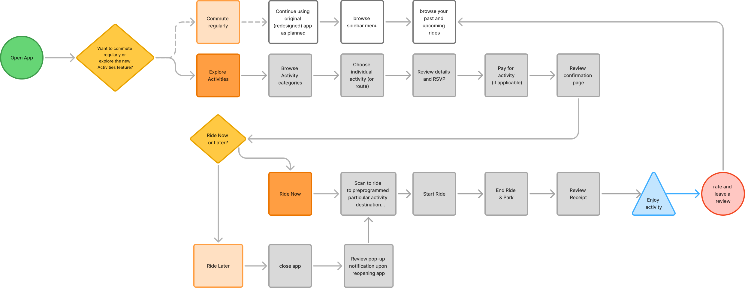
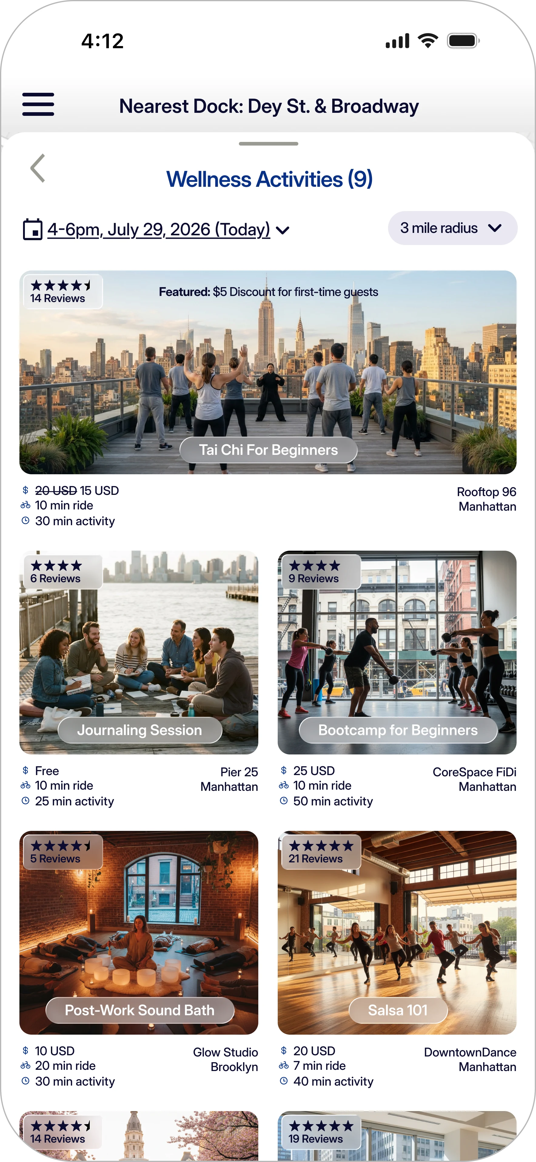
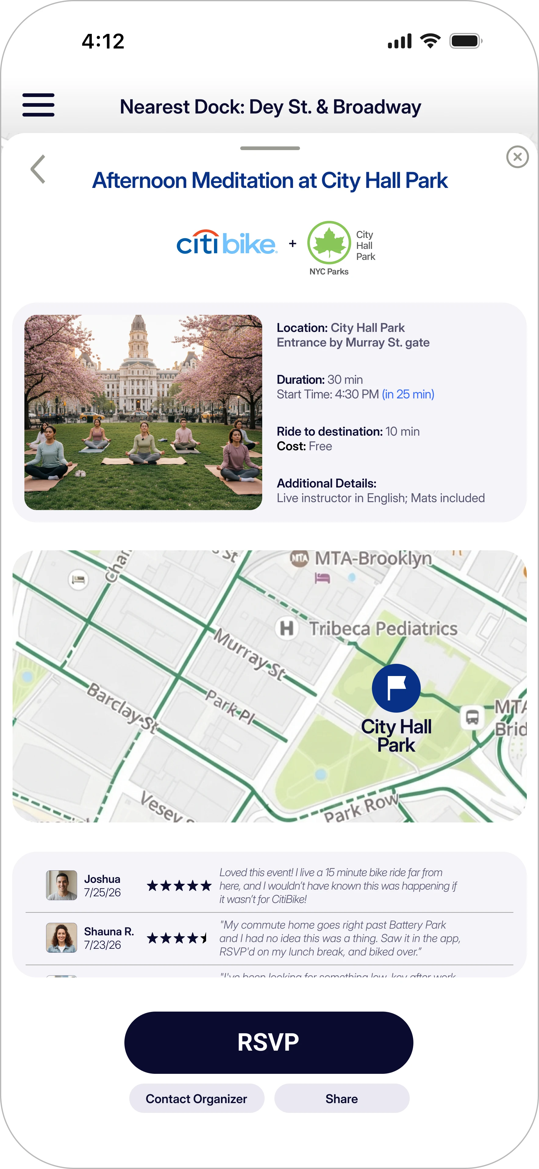
Reflection & Next Steps
The biggest lesson was knowing when to cut. The first designs tested well at the screen level, but asking users to navigate four new features inside a simple app seemed to add complexity without matching how people actually use the current app. One focused behavior turned out to be the stronger design decision.
Next steps would include:
- Validating the concept through a demand study: A crucial part of this stage would be to survey prospective and existing Citi Bike riders to measure actual interest in activity discovery before investing in full development. The usability testing confirmed people can use the feature, but hasn't yet confirmed they would seek it out on their own.
- A second round of usability testing on the full flow of RSVPing and riding to an activity.
- Work with Citi Bike to formalize activity listings — via a two-source data model:
- Partnering with organizations (like FitHouse Tribeca, Glow Studio, CoreSpace FiDi) to reach riders through paid placement.
- Aggregating public data for free events and activities that don't require formal partnerships.