← Shaker case study
Heuristic Evaluation
10 different categories from the ABBY Method were used for understanding the following sections of Shaker:
- Landing Page (Existing live version)
- Signing Up for the Platform: (Beta version)
- Creating a Community on the Platform (Beta version)
- Adding Contacts on the Platform (Beta version)
Performs well (3)
Needs Improvement (2)
Critical Issue (1 or below)
Landing Page
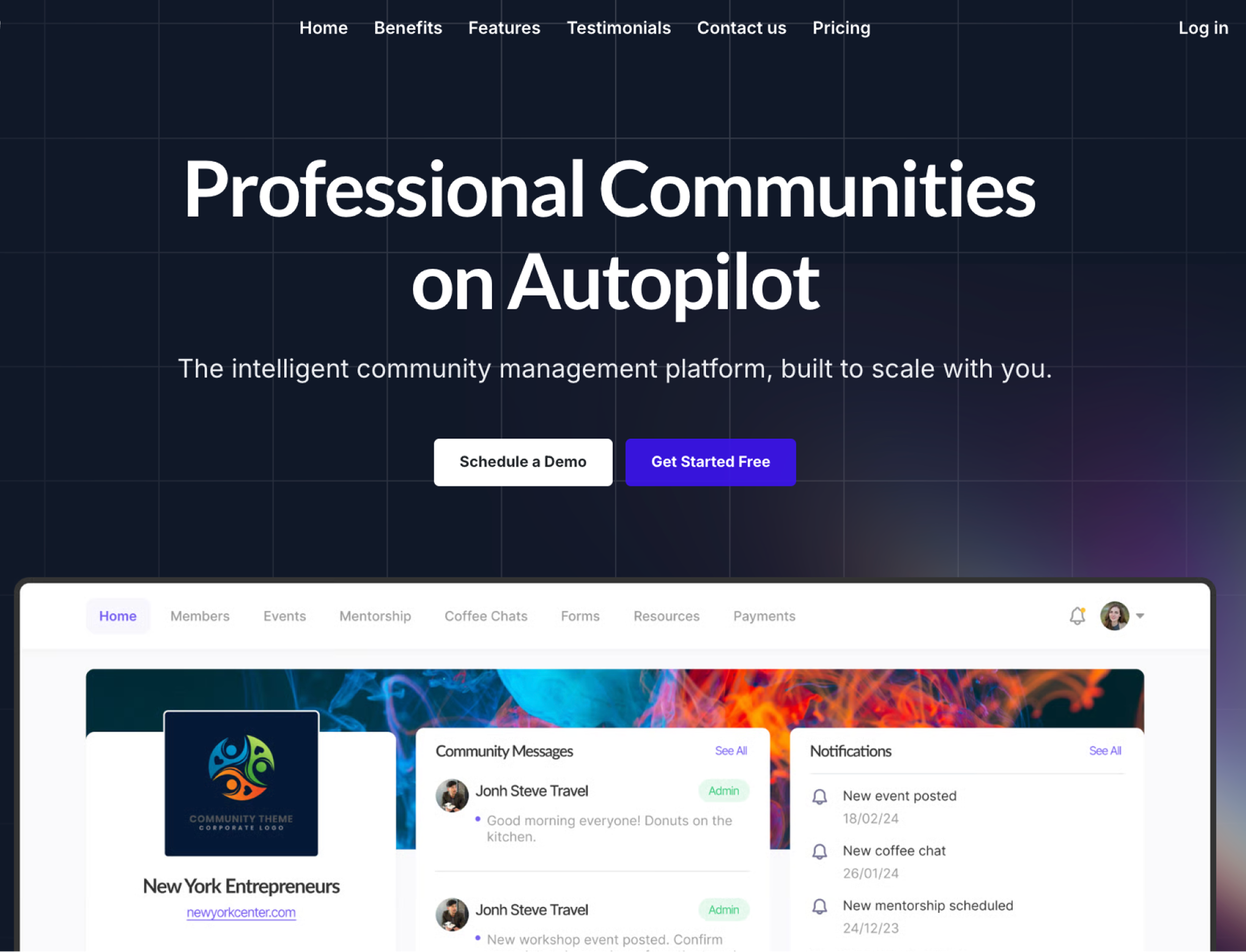
Key Takeaways — Observations
- Navigation: Users move through the page by clicking header tabs or scrolling, with all sections contained on a single page; however, tabs may feel like separate pages and there’s no search functionality.
- Call to Action: “Schedule Demo” and “Get Started Free” buttons are prominently placed in multiple locations, making the main tasks obvious and easy to complete.
- Design: Page looks polished and on-brand, though some accessibility issues (color contrast) and low initial impact mean users may need multiple reads to absorb the content.
- Feature Awareness (but with gaps): Page effectively communicates key offerings (events, coffee chats, mentorships) but some clickable elements only change images, and testimonial visibility is limited.
- Reliable Experience: Messaging and navigation are consistent, errors are minimized, and there are clear options for feedback or contacting Shaker, (though personal interaction may soon be automated).
Key Takeaways — Recommendations
- Add search and nav improvements: Include a search bar and make header sections link to fully built-out pages for deeper exploration; keep the header fixed for easier access.
- Reorganize content hierarchy: Restructure text and images for a more intuitive flow and clearer emphasis on key information.
- Highlight key features: Present Shaker’s main offerings more prominently so users leave with a stronger understanding of its value.
- Existing users: Add a way to view recent and multiple testimonials.
- Enhance visuals: Incorporate animations and design elements that guide users through the page.
Sign Up
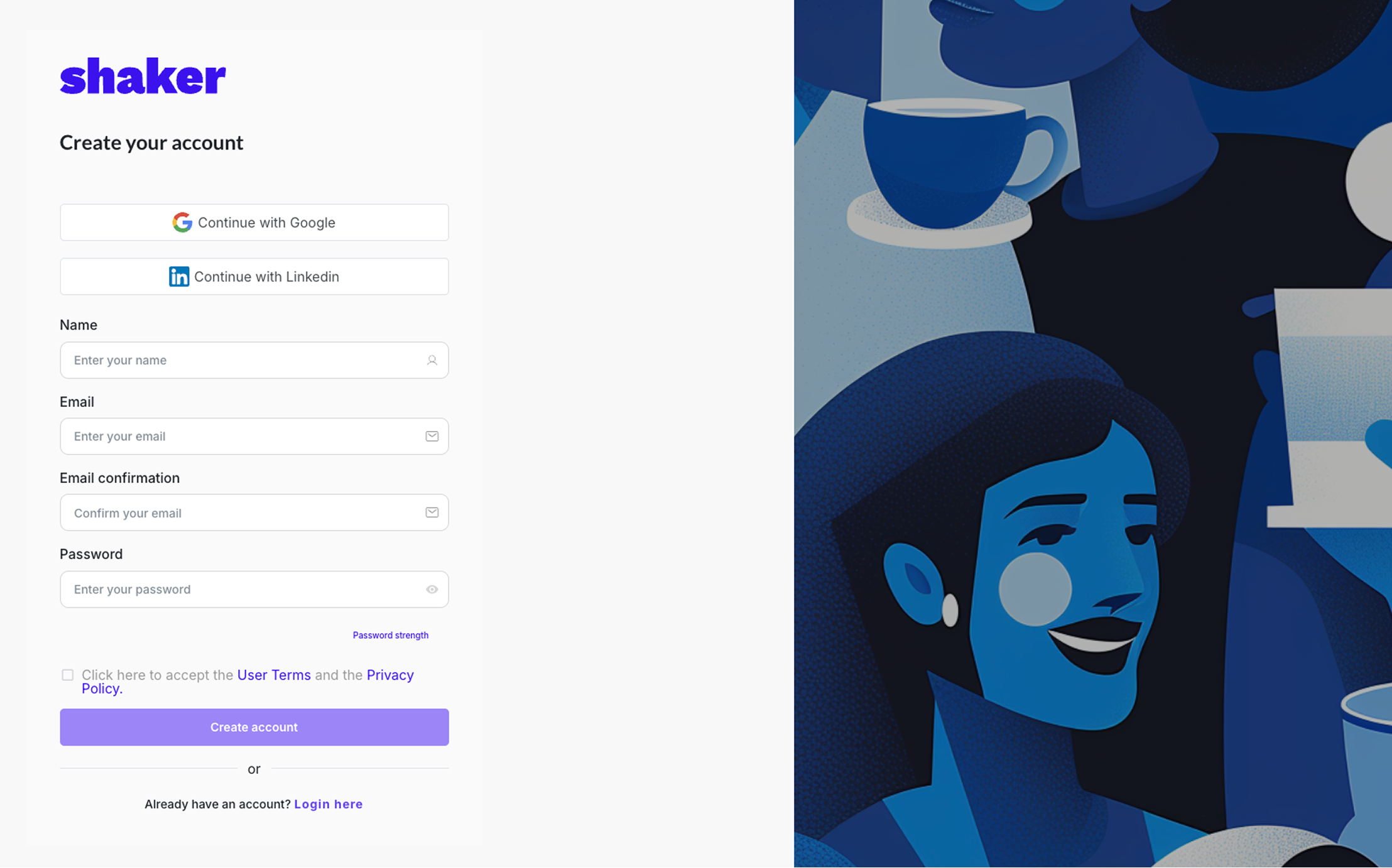
Key Takeaways — Observations
- Familiar design: Clean, uncluttered layout modeled after common sign-up pages, making it quick for users to understand and complete tasks.
- Navigation and access: Multiple, consistent entry points for sign-up/login, with quick options via Google or LinkedIn, manual entry, or one-time email links.
- Responsive and accessibility: Works seamlessly across desktop, mobile, and tablet, adjusting UI for screen size and clearly showing interactive elements (e.g., purple buttons).
- Consistency: Behaves predictably, supports task completion without confusion, and meets usability best practices for Shaker’s audience.
- Support: Provides feedback for errors, password recovery, and assistance through a feedback/help tab, though some icons may be unclear.
Key Takeaways — Recommendations
- Expand login options: Add phone number login to complement Google and LinkedIn for faster, more flexible access.
- Adjust visual hierarchy: Remove or reposition the welcome text to reduce competition with the Shaker logo.
- Soften color palette: Reduce the intensity of vibrant blues and purples for a more comfortable visual experience.
- Simplify error messaging: Combine them into a single clear message or display the error text directly above the password field to reduce unnecessary interruptions.
- Refine iconography: Replace mismatched feedback icons (e.g., use a lightbulb for “feature request”) for clearer meaning.
Creating a Community (Page 1)
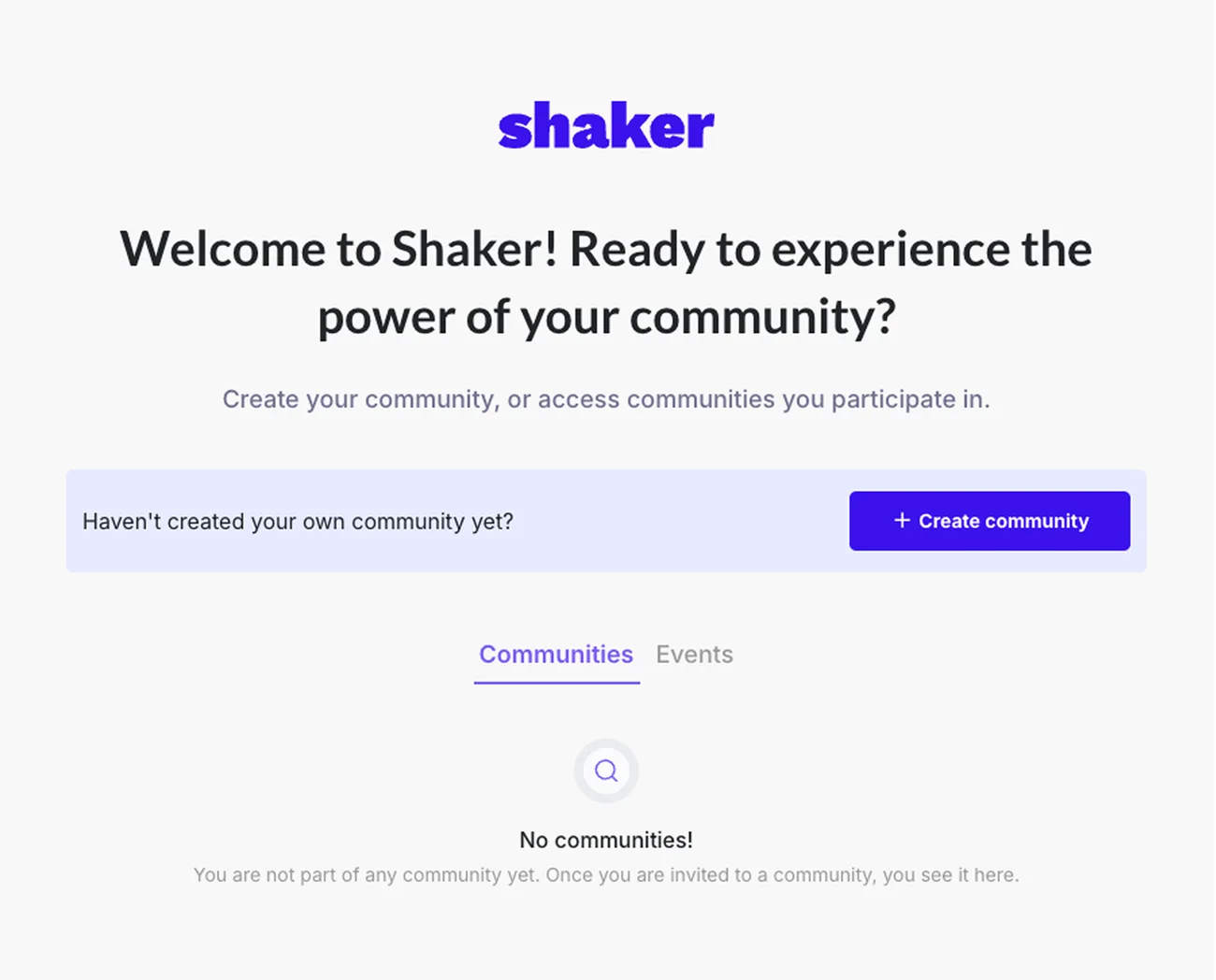
Key Takeaways — Observations
- Usability with clear navigation: Users can generally find what they need, with consistent messaging and navigation that orients them across tasks.
- Accessibility/Clarity: The page meets basic accessibility standards and uses understandable language, though some terminology might still confuse.
- Task Completion: Users can complete goals without significant blockers, but the path isn’t highly polished or streamlined.
- Design and engagement: The layout feels sparse and not very inviting, with unclear exits and important controls, and lacks visible support or contact options.
- Meets but doesn’t exceed expectations: The platform serves new and loyal users adequately but doesn’t provide standout features or ease of discovery for key elements like existing communities.
Key Takeaways — Recommendations
- Reconsider Events tab: Remove or hide the “Events” tab until communities are created to avoid confusion for new users.
- Clarify options: Replace “Haven’t created your own community yet?” text with two clear buttons: “Create” and “Join” to balance new and existing users.
- Add support access: introduce a dedicated help or contact button alongside the existing feedback option.
- Improve navigation controls: Add a back button for easier user movement within the page.
- Refine visual layout: Reduce excessive spacing between UI elements (light blue and dark blue boxes) to minimize distraction.
Creating a Community (Page 2)
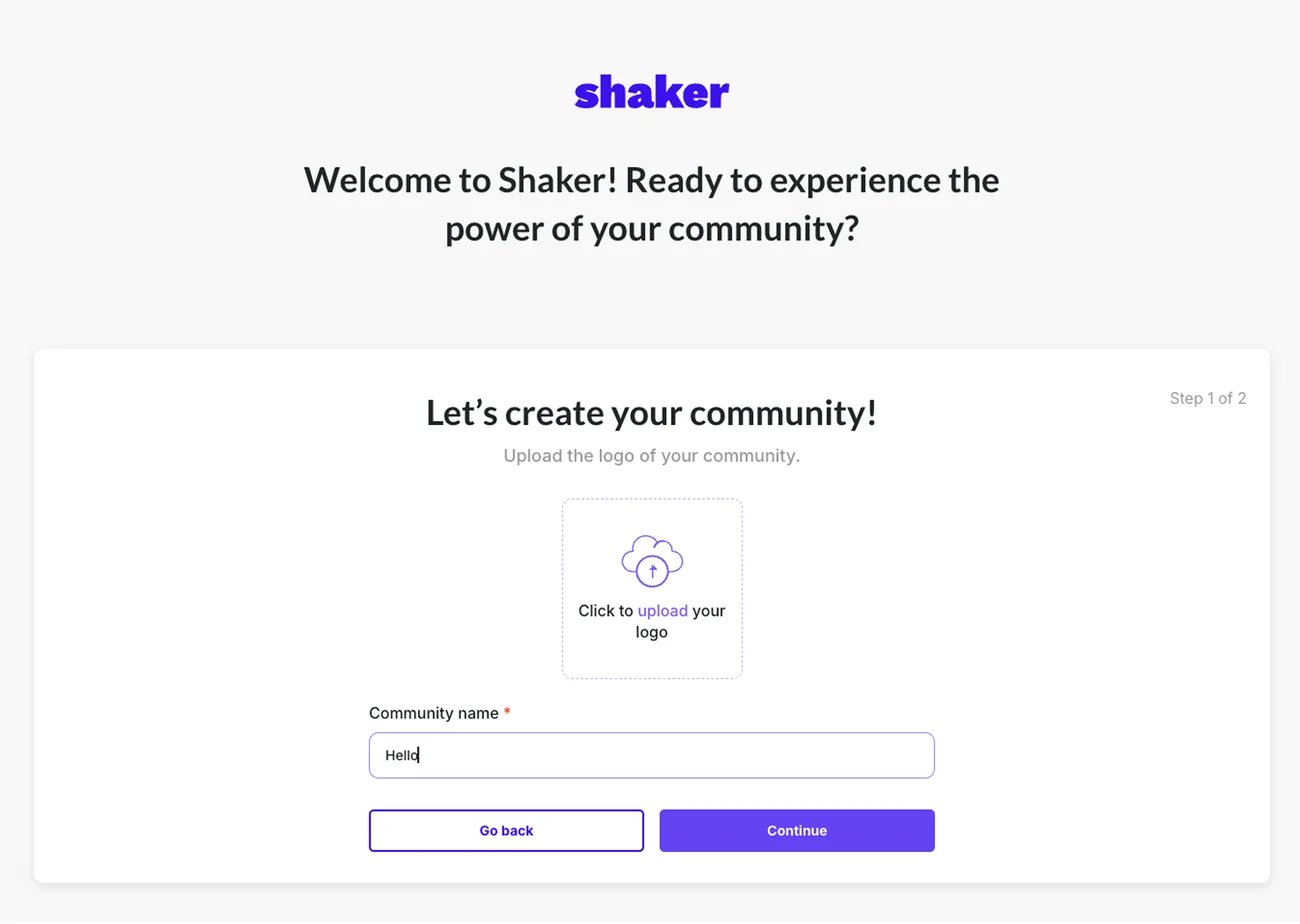
Key Takeaways — Observations
- Clear but repetitive onboarding: Status and location are visible, and navigation helps orient users, but some prompts (e.g., “upload logo” and “enter community name”) appear twice, and the welcome message repeats unnecessarily.
- Mixed effectiveness in messaging: While the interface fosters a sense of place, certain text feels redundant or unclear, reducing impact.
- Minor interaction frustrations: A brief lag after clicking “Continue” causes uncertainty despite good connectivity.
- Error handling and controls: Errors are well-prevented and recoverable, but key exits and controls are not clearly marked.
- Clicking “Go Back”: Unexpectedly saves an unfinished community, displays an incomplete list of nine communities, and offers no option to delete unwanted ones.
Key Takeaways — Recommendations
- Progress clarity: Make “Step 1 of 2” more noticeable using color and improve the header text for better guidance.
- Logo flexibility: Remove the mandatory logo upload prompt and let users add a logo now or skip for later.
- Label Improvements: Change “Community Name” to “Community/Organization Name” and add example placeholder text like “e.g. Association of Brooklyn Diners.”
- Usability enhancements: Add a help button and fix any lag after clicking the continue button for smoother navigation.
- Brand integration: Incorporate illustrations and team photos to reinforce brand identity and create a welcoming atmosphere.
Adding Contacts
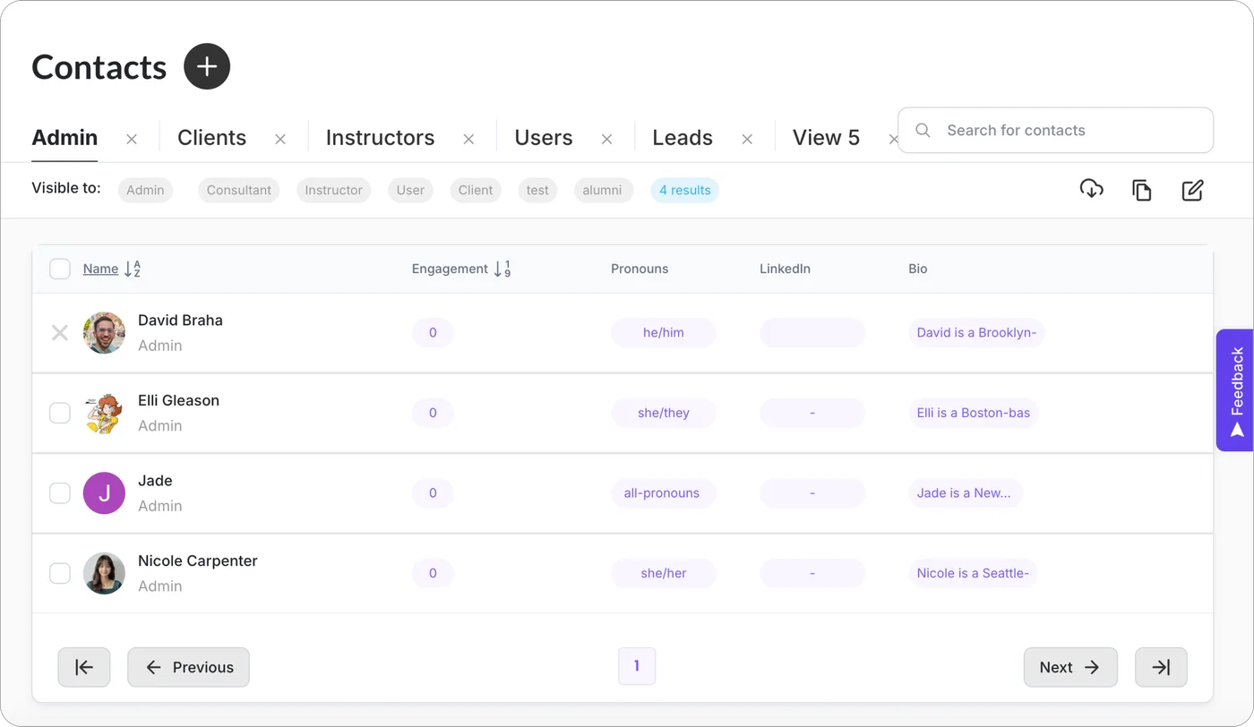
Key Takeaways — Observations
- Design: The site is visually cohesive with polished animations and good readability, providing a pleasant overall aesthetic.
- Navigation and Clarity Challenges: Some UI elements like the contact views tabs, multiple unmarked plus buttons, and engagement metrics are confusing or unclear initially.
- Profile Management: Adding and editing contact profiles is difficult, with no standardized fields, cramped editing spaces, and confusing flows causing dead ends.
- Useful Features: Despite initial struggles, the contact info and dynamic views become valuable tools once data is properly entered.
- Improvement Opportunities: Buttons for download, edit views, and feedback placement could be clearer and better positioned to enhance usability.
Key Takeaways — Recommendations
- Improve clarity of buttons and icons: Label each plus and other key buttons with their specific functions, using clear text or tooltips.
- Enhance onboarding and feature explanation: Add popups or visual examples during onboarding to demonstrate what features do and how they help.
- Streamline navigation and layout: Reorganize button placement for managing views, make the back button more visible, and ensure related functions are grouped logically.
- Make profile editing more intuitive: Provide 1–3 pre-filled property examples, label property elements clearly, and consider auto-populating data from imported CSV files.
- Ensure consistency across pages: Keep labels, functions, and layouts cohesive between pages so users can easily recognize and remember where to find things.