
SaaS Platform Revamp
An all-in-one digital management interface for Community Managers to run their organizations intuitively and efficiently
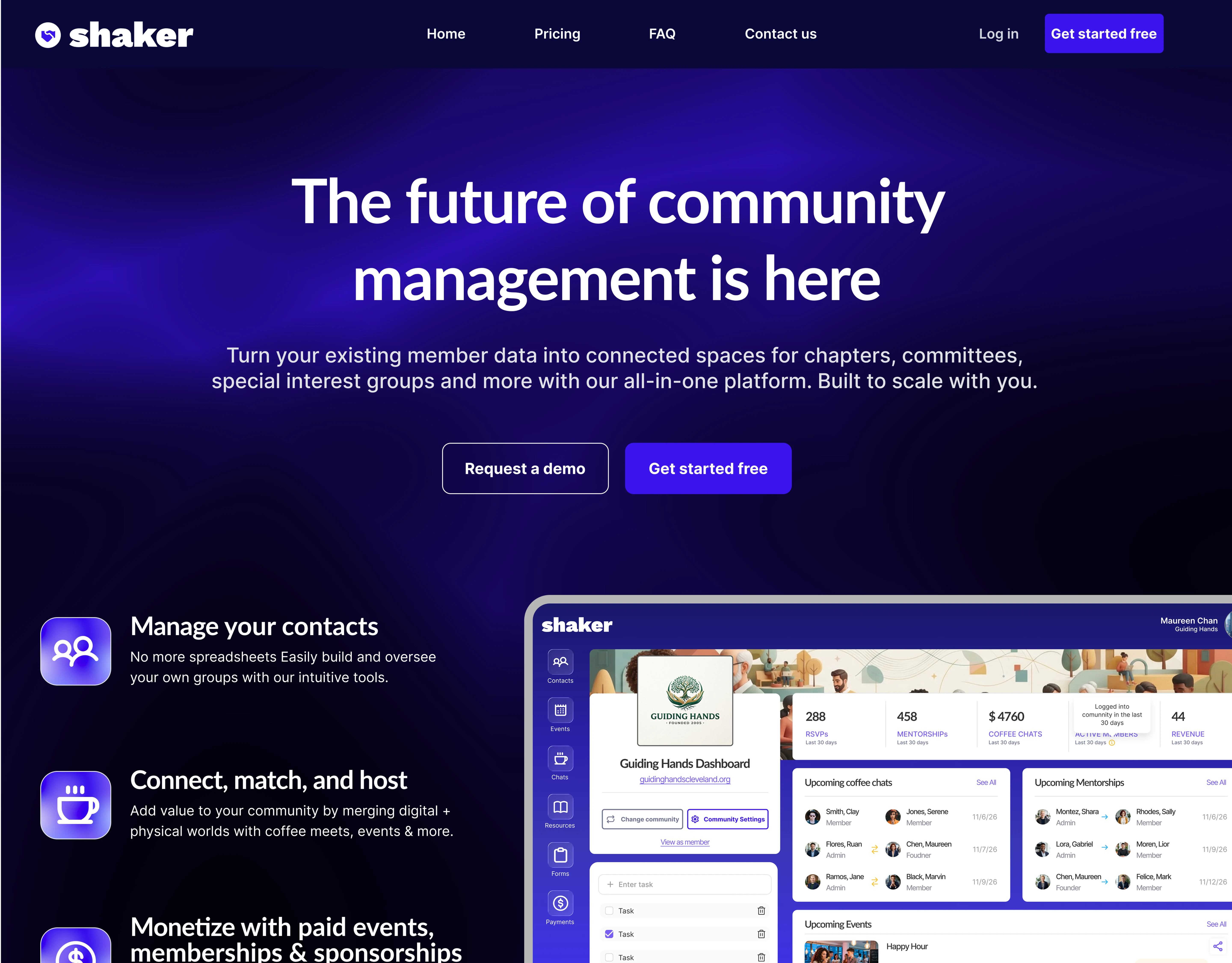
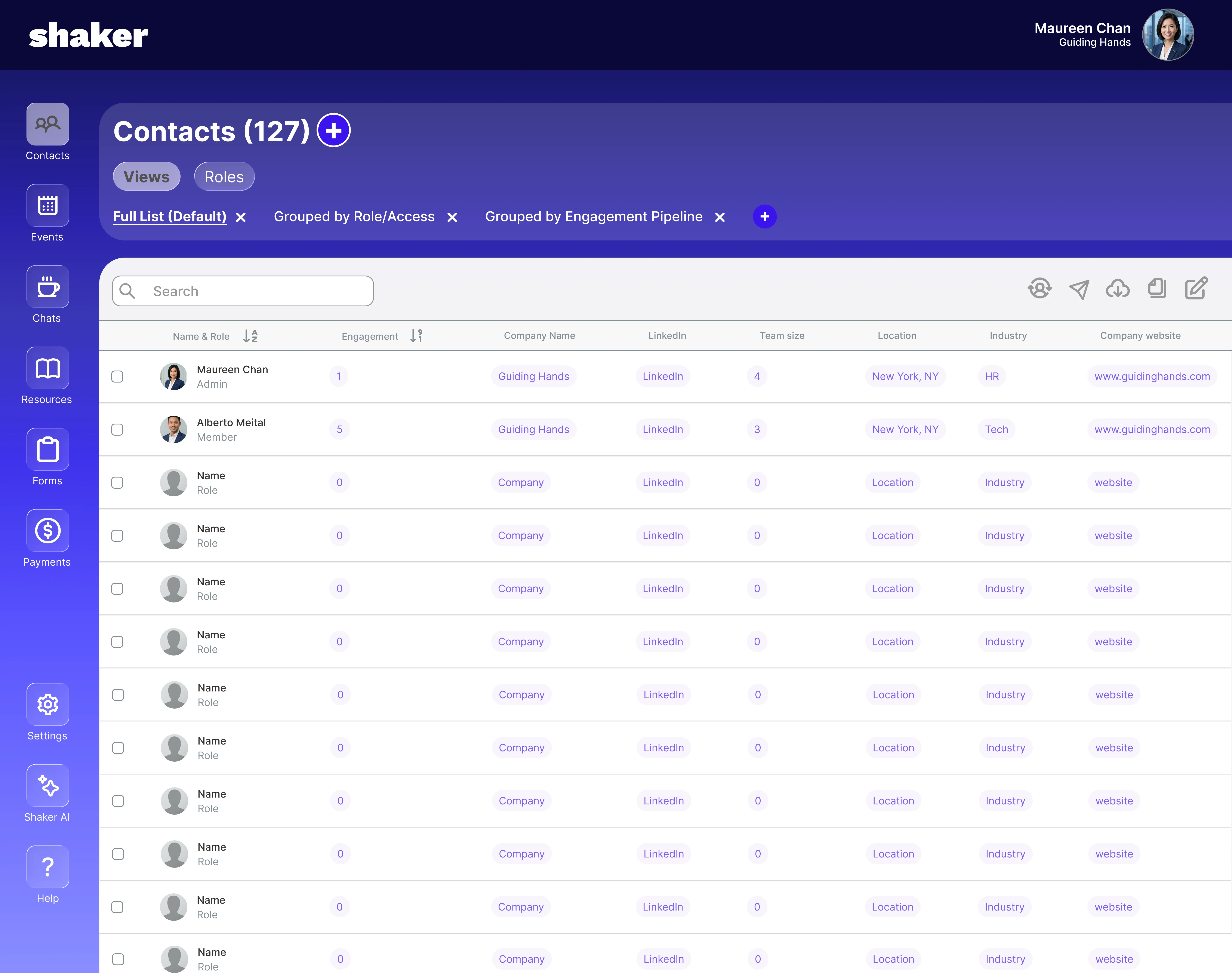
Within a team of four, I led a redesign of Shaker’s landing page, onboarding flow, and core platform features for a more intuitive experience. As Project Manager, I kept the four-week timeline on track, created task roadmaps, and coordinated team responsibilities across research and design.
The Challenge
Shaker needed a UX redesign to better convert prospects into paying users. Though Shaker offers useful tools, users struggled to see the up-front value and found it difficult to set up their group space.
Community Managers need streamlined onboarding and clear communication of features to feel confident in its value and quickly master its functions.
Four easily digestible pillars of what Shaker actually does were identified via research, which guided the design process:
Manage
contacts of new and existing communities
Connect,
host, and mentor within communities
Monetize
with paid events, memberships or sponsorships
Integrate
with favorite apps and engage contacts where they are
The Research
Research focused on holistically exploring Shaker as a company, as well as testing the existing user flow from the landing page and sign up page, to the onboarding experience and finally to adding contacts in the platform.
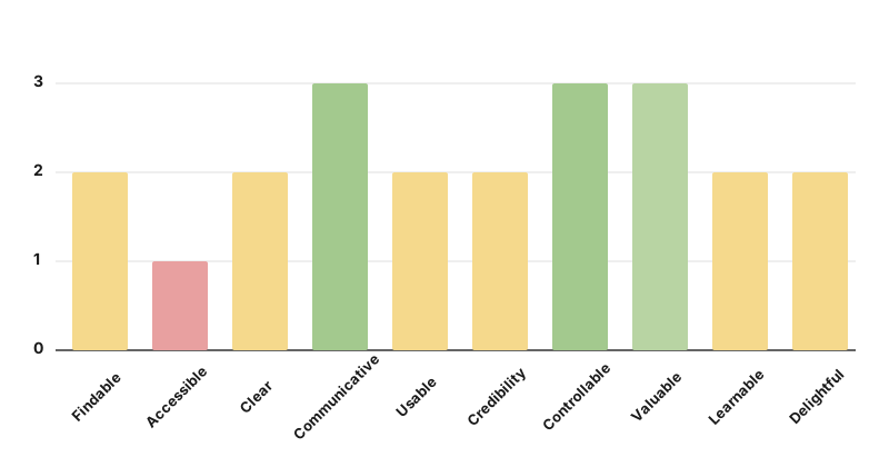
1) Heuristic Evaluation
Evaluating Shaker’s existing site against usability benchmarks
10 different categories from the ABBY Method were used for understanding the following four sections of Shaker:
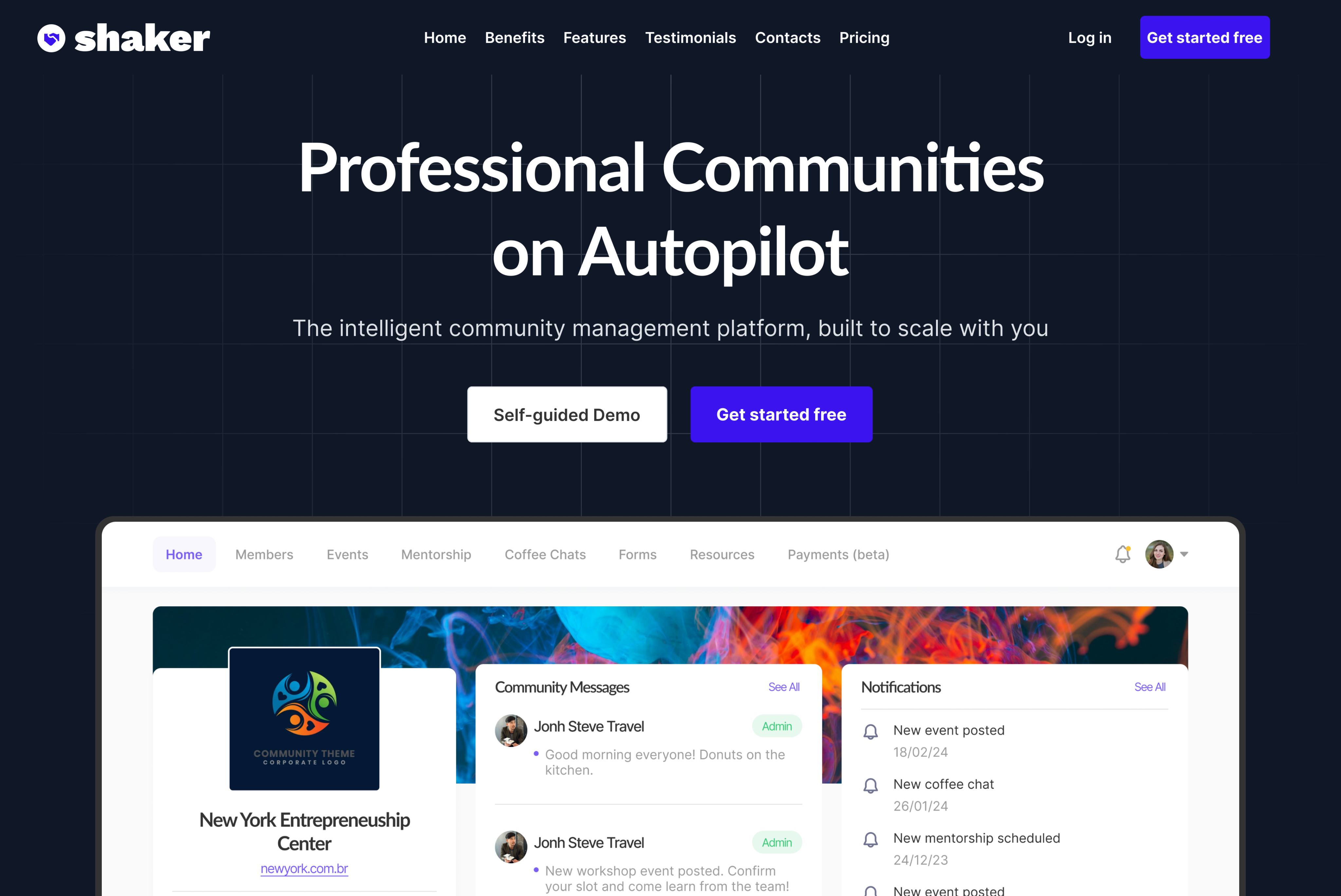
- Landing Page (Existing version; sampling below)
- Signing Up for the platform: (Beta version)
- Creating Community on the platform (Beta version)
- Adding Contacts on the platform (Beta version)
2) Competitive & Comparative Analysis
Where Shaker lies within the industry landscape
SWOT Analysis
- Effectively communicates key offerings
- Valuable features
- Leads in contacting
- Leads in help functions
- Visually very professional
- Obvious call to actions
- Navigational and organizational challenges
- Website doesn't clearly express differentiators from competitors enough to entice people to switch
- Does not express the platform's diverse utilities well enough to give people confidence in signing up
- Overall website copy and word choice to be evaluated
- Restructure pages for a more intuitive flow and clearer emphasis on key information
- Competitors with more multi-page layouts could make their information easier to digest
- Competitors give more accessibility which may create a smoother user experience
Plus / Delta Chart
Pluses
- Professional
- Gets to the point when it comes to logging in
- Color scheme helps with navigating giving a hierarchy on what the priorities are
Deltas
- Very scroll heavy
- Users need to either scroll all the way down or up to sign in
- Too much info on just one landing page may cause issues

Pluses
- Flexible and free to use while providing perks for paying users
- Rich real-time communication popular for fostering communities across interests
Deltas
- Not the best way of sharing documents
- Content can get blurred or distorted
- Not optimized for structured community workflows. More catered towards entertainment

Pluses
- Highly customizable
- All-in-one cohesion (e.g.: integration of social media features, live streams, courses, chat spaces, etc.)
Deltas
- Pricy
- Some advanced features require higher-tier plans

Pluses
- Seems more tailored toward schools
- Integrates many administrative tools
Deltas
- Very crowded
- Large scope may be overwhelming for non-academic use cases

Pluses
- Professional
- Incorporates social media aspects (e.g.: being able to post a portfolio and seeing it on one's account)
Deltas
- Unable to access or create an account through home screen
- Required to schedule a demo if hoping to use.
- No pricing page
3) User Interviews
Understanding Shaker’s existing site and platform
Research revealed that Shaker’s value and purpose weren’t fully clear to users, emphasizing the need to redefine its offering in a more direct and understandable way. Users struggled to understand who the platform was for, how to use it, and why they should sign up, while navigation issues made existing features harder to access.
Highlights included:

Sarah T., 34, Chicago
On understanding Shaker's advantages:
“I want the landing page to clearly explain who the platform is meant for, best use cases, and what ‘Turning your contacts into an engaged community’ means.”

James R., 41, Miami
On more guidance during onboarding:
“I need clearer onboarding prompts, loading feedback, and secure login confirmation.”

Chanel M., 35, Brooklyn
On the improvement of intuitive visual cues:
“I was initially confused by the organization: Labels and buttons weren’t clear, I couldn’t easily see the hierarchy between roles, and not being able to invite members in bulk was frustrating.”
Understanding the User

Maureen M.
42; Houston, TX — Teams Manager at public health non-profit “Guiding Hands”
Maureen is an expert in her field managing several teams with many different needs. However, with a constantly growing company and ever-changing team goals, she is not the most tech-savvy and sometimes struggles to keep track of the needs of every single person she is responsible for.
Users like Maureen may include:
- Startup / Accelerator Program Managers
- Nonprofit Membership Coordinators
- Professional Association Managers
- Alumni Relations Managers
- Co-working Community Managers
- Cultural / Sports Club and Recreational League Organizers
The Design
Nine essential, top-level features in the order a new user meets them were prioritized for redesign with a full facelift. (Additional UI improvements were subsequently added after the sprint as well.)
1. Homepage
What testing showed: Community Organizers didn't immediately know exactly what Shaker was and who it was for. They struggled to see the value from the web copy.
What I changed: The homepage was rebuilt around people with a persona carousel, real faces, client logos and more, so it reads as a premium product rather than a collection of bland-looking content blocks. Users need to see themselves in it and immediately get it; not be sold to by a generic SaaS page.


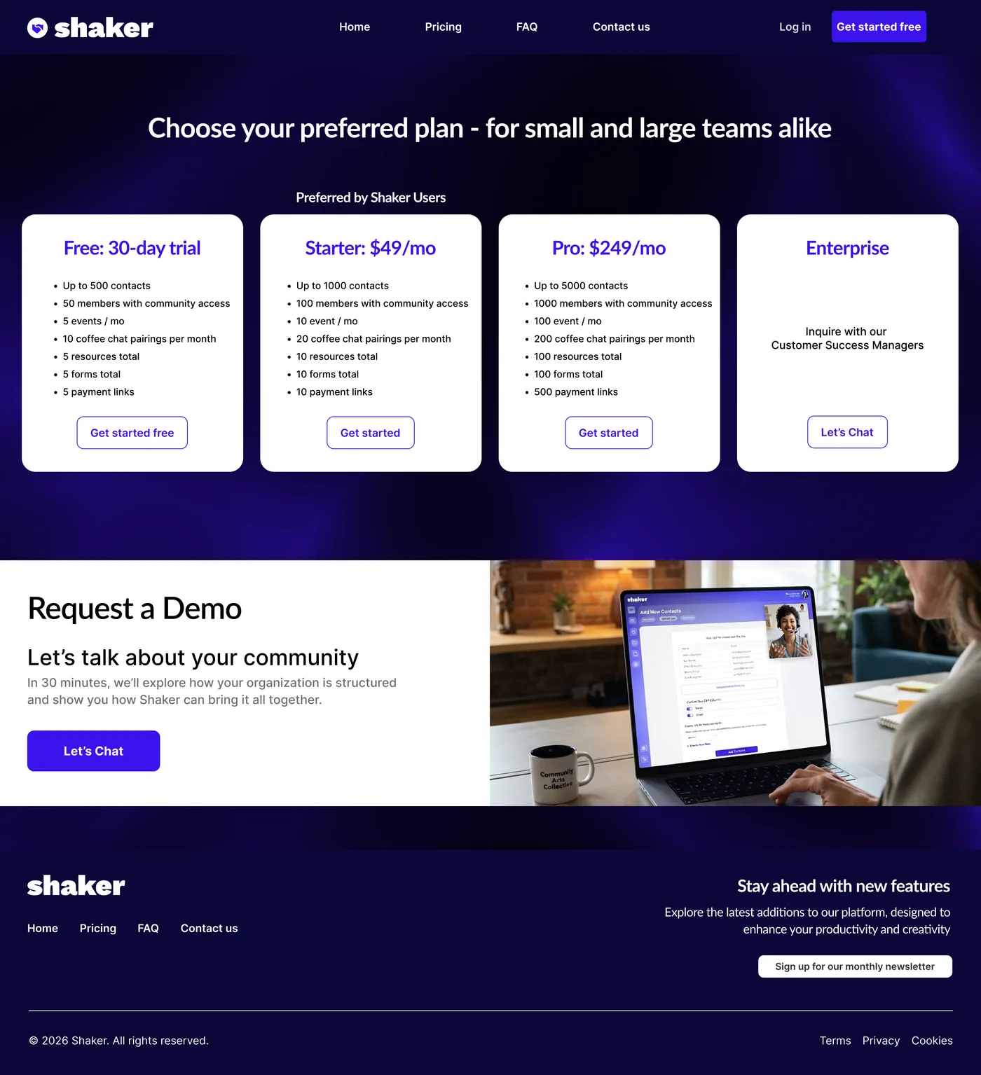
2. Pricing
Design reasoning: Pricing is where someone decides whether to commit, so the recurrence of the demo CTA was used here.
What I designed: A new Pricing page was created — previously missing despite being referenced in the original FAQ — consistent with the design language of the rest of the site. (Not yet validated with users.)
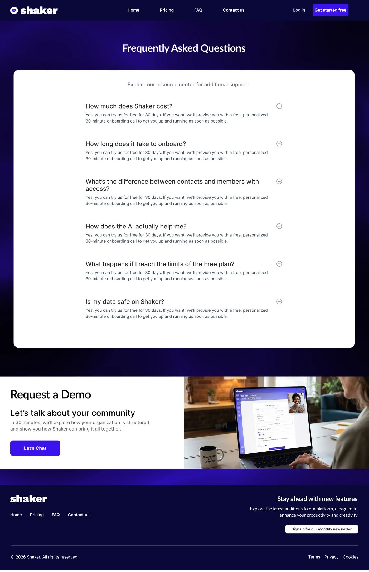
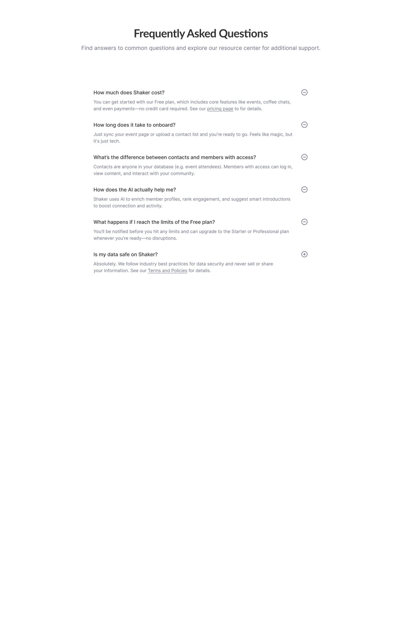
3. FAQ
What I changed: The FAQ was moved onto its own page with consistent design language as the previous pages. (Not yet validated with users.)
4. Demo
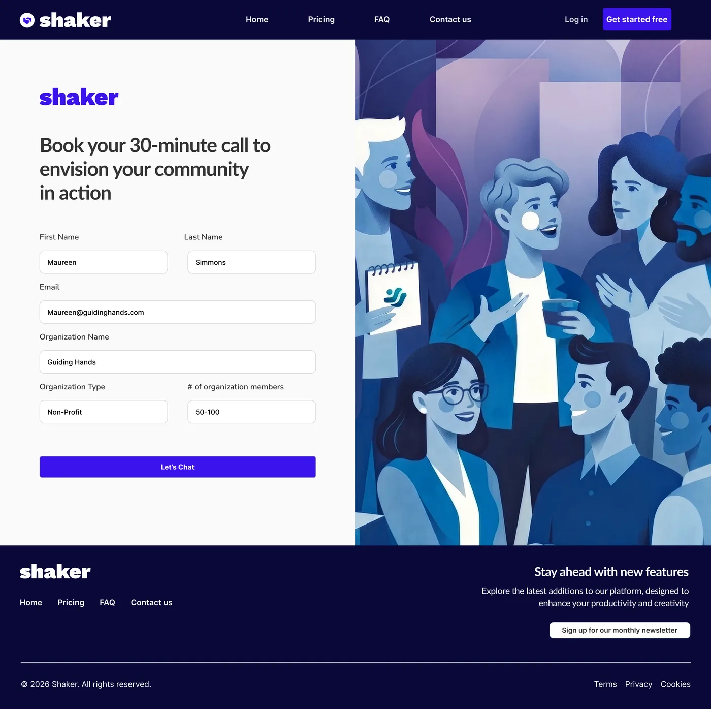
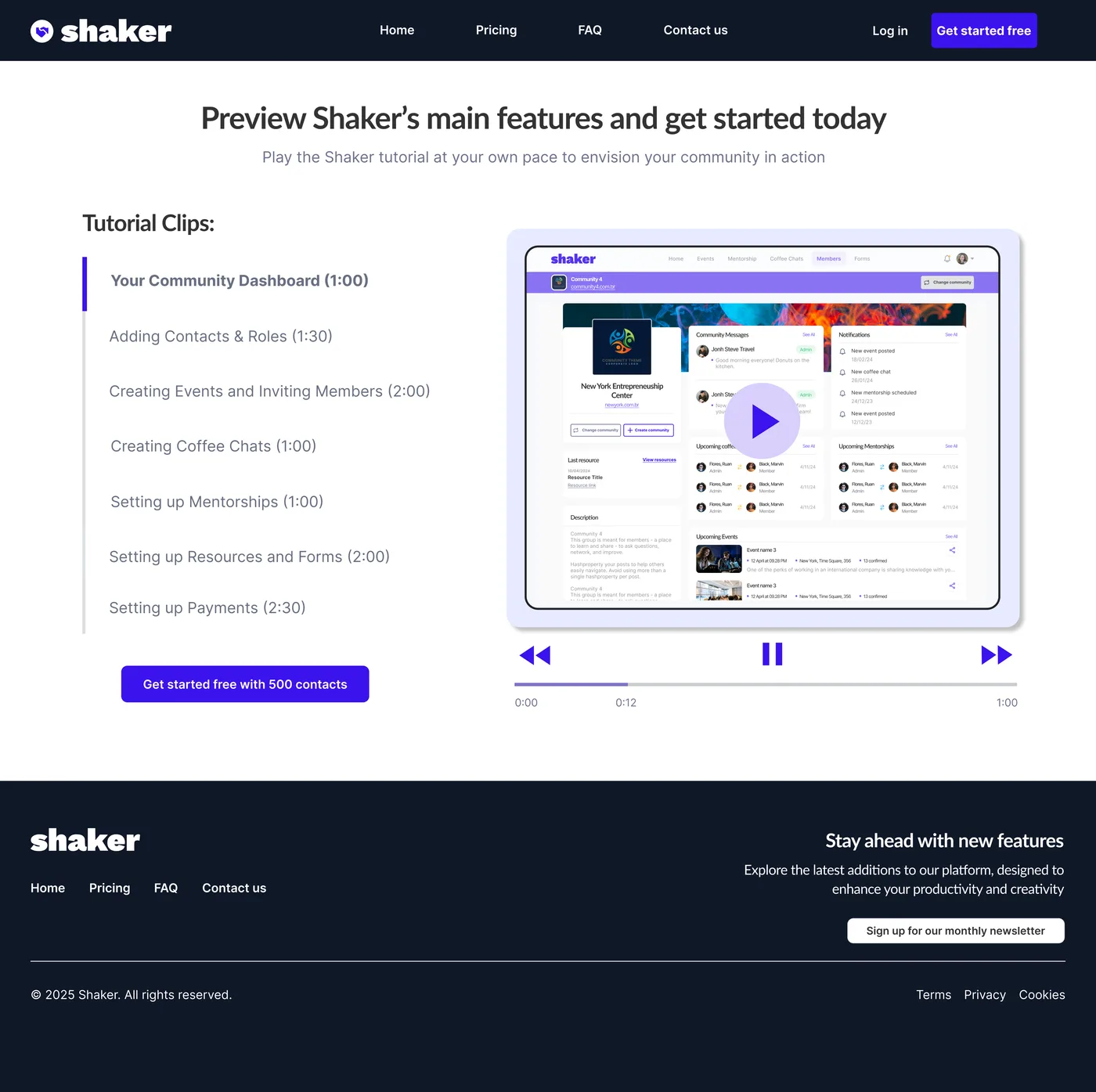
What testing showed: The first design attempt learned from our first build featured an automated demo as a video tutorial. It didn't hold up since the format asked prospects to work out for themselves which parts applied to them.
What I changed: The tutorial was completely scrapped for a request form and a scheduled call. In competitive B2B, dedicated time with a prospect is the value; sometimes the better experience is finding where the company should absorb the effort instead. (Not yet user-tested.)
5. Sign-up
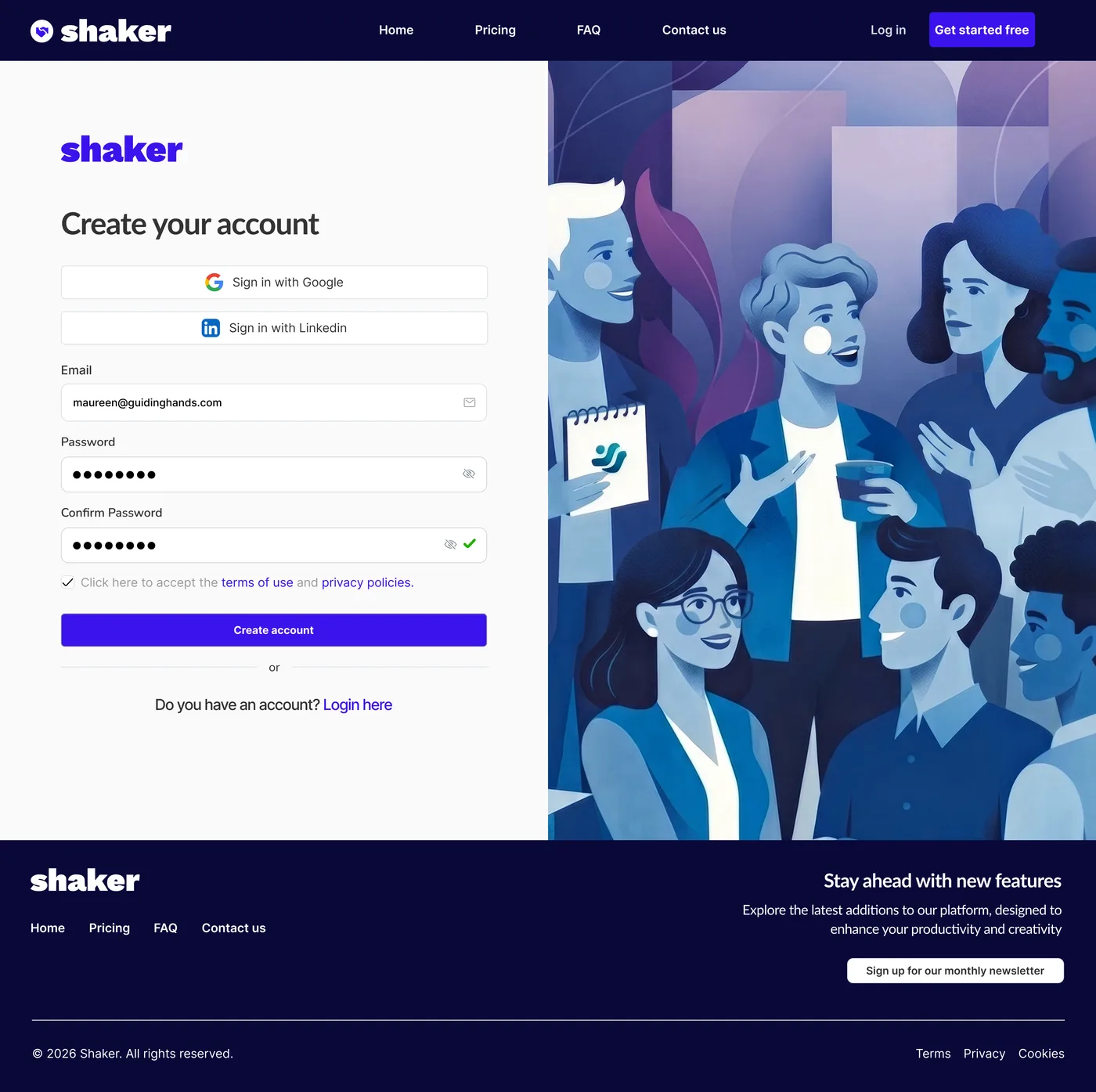
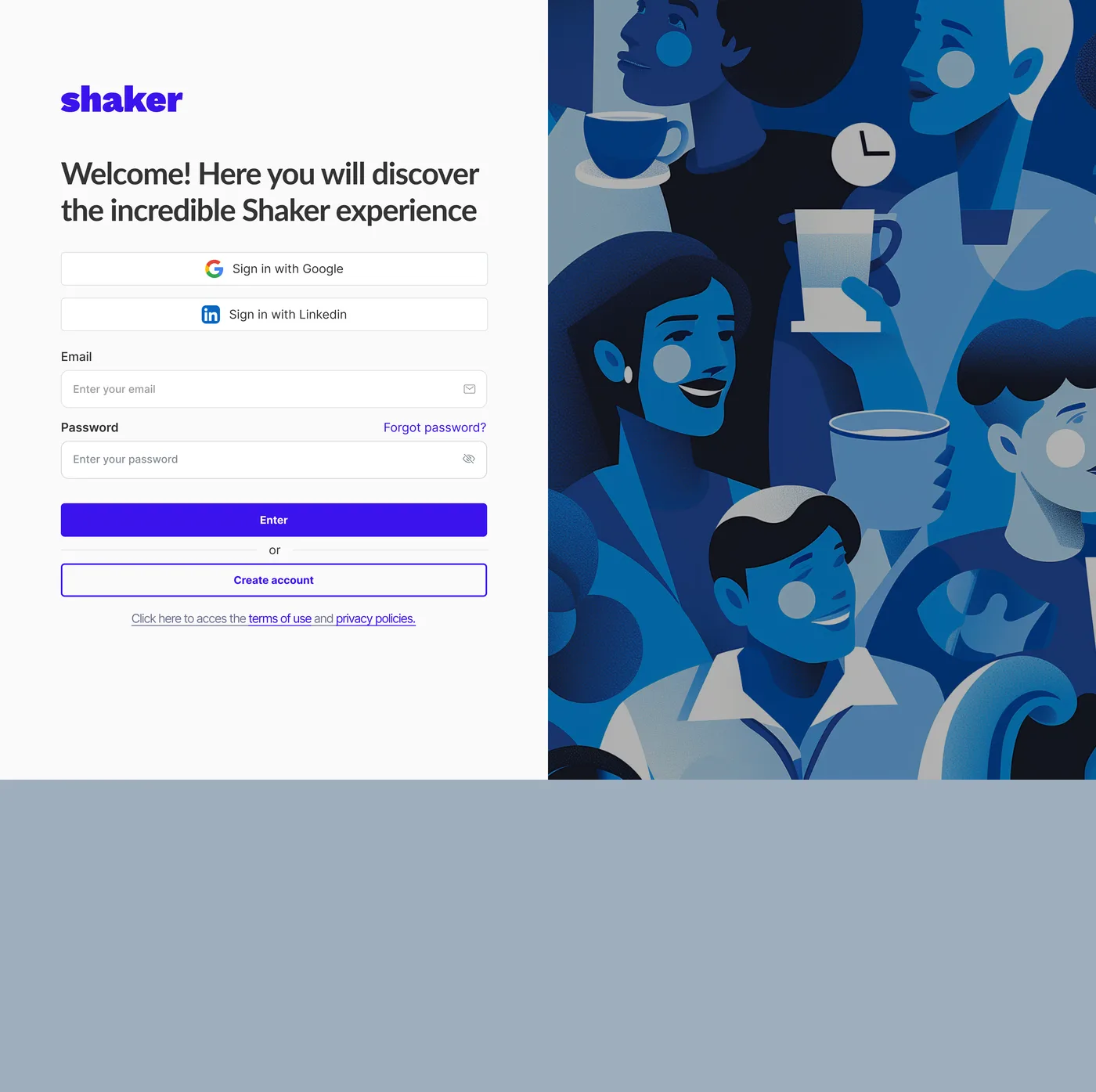
What testing showed: Sign-up was smooth overall, with minor areas for improvement like removing clutter, and adding double-authentication and a loading state. Illustrations were also tested as misleading, which led to a redesign of the abstract users in action.
What I changed: Most people arriving haven't signed up yet, so a straightforward create-an-account was created, without unnecessary cringe-like wording.
6. Dashboard
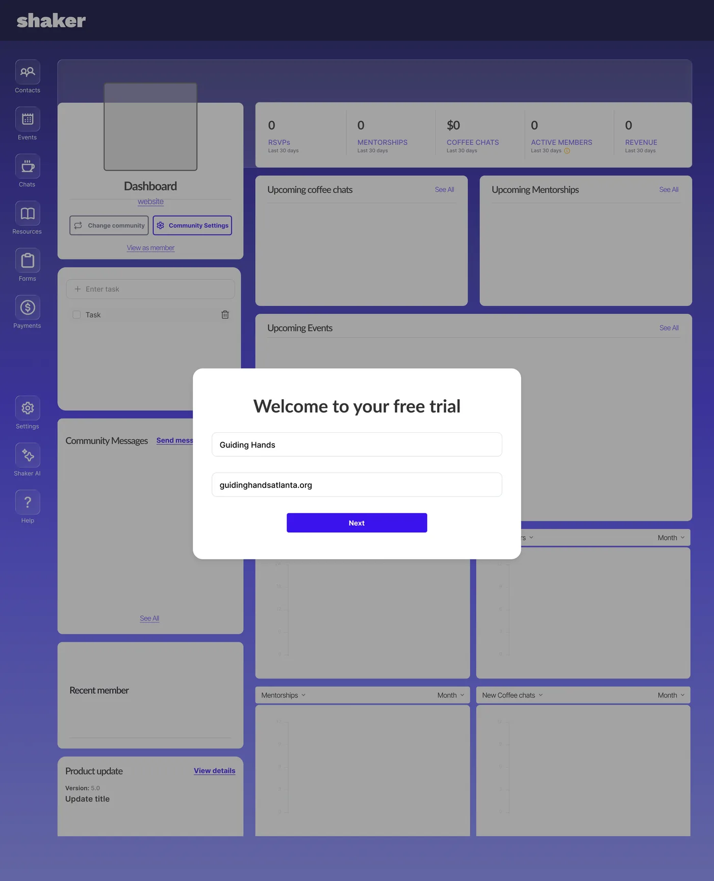
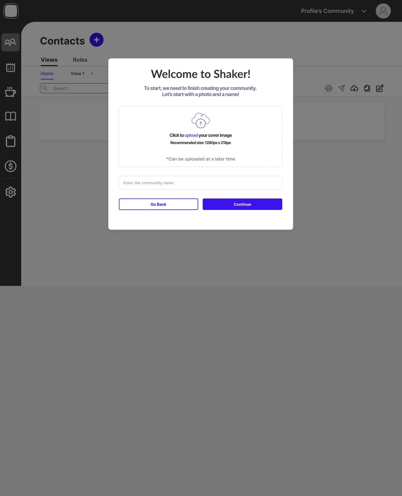
What testing showed: Users landed on the Contacts page when they should have been going to a dashboard.
What I changed: The overlay builds anticipation during setup, then clears to fill with their own information, rather than another form.
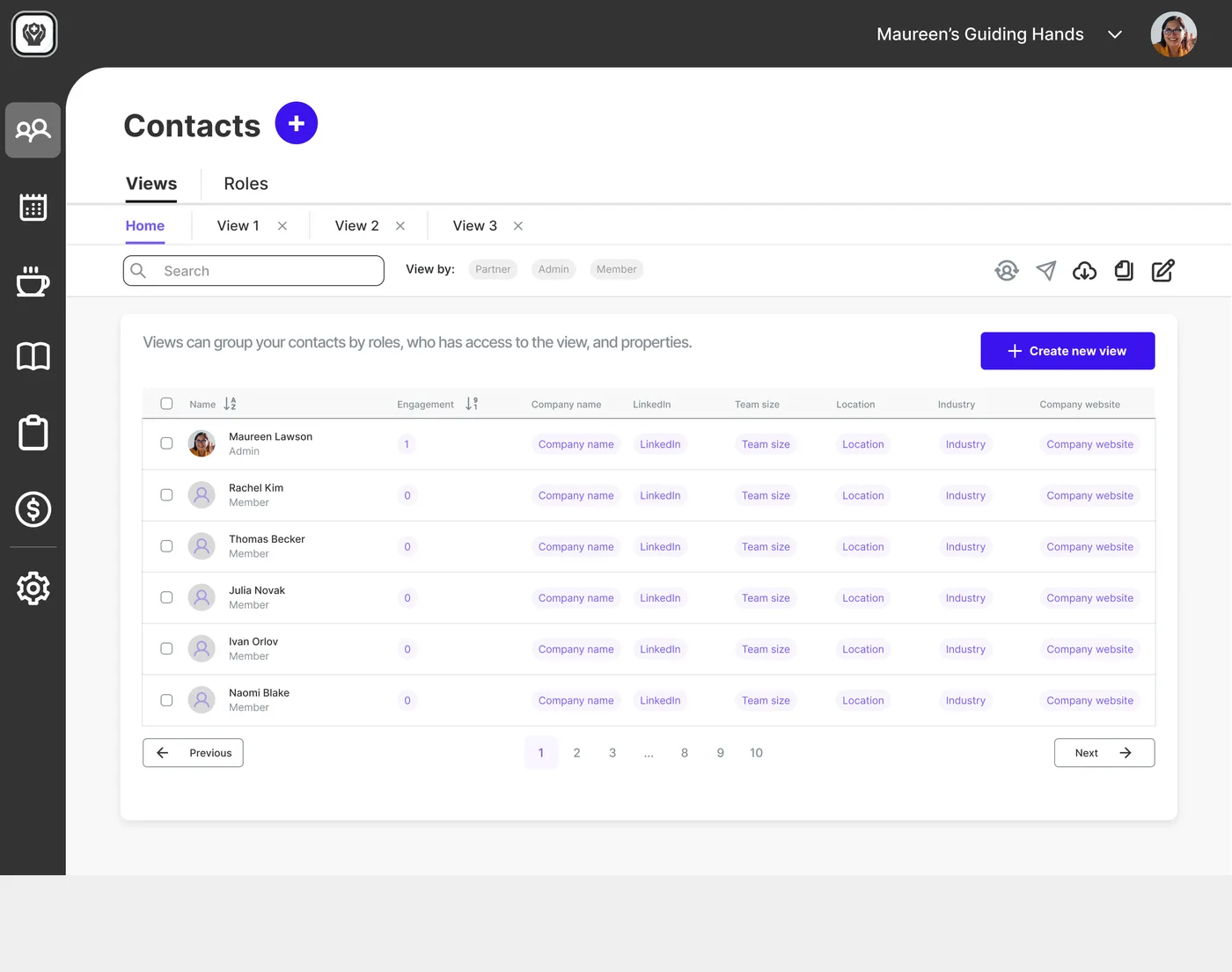
7. Adding Contacts
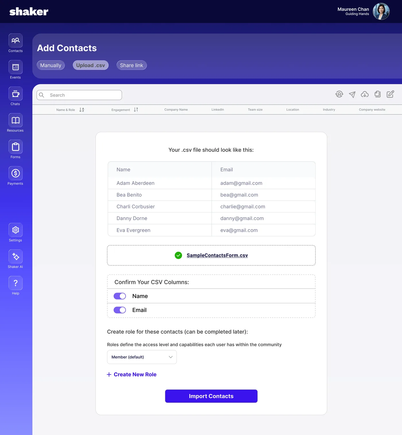
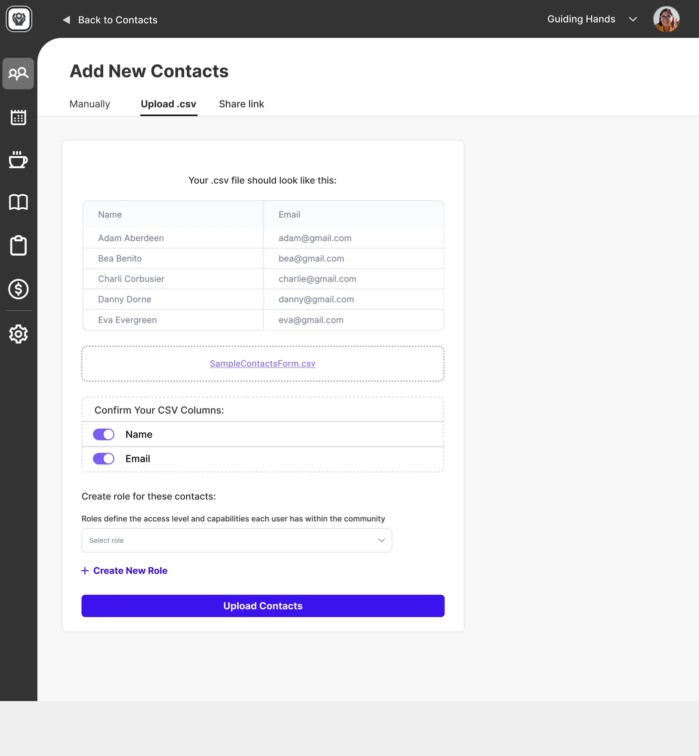
What testing showed: Users struggled to navigate the Contacts page and understand what the buttons did.
What I changed: Clearer buttons and affordances were added to make the UI more intuitive, and the flow became a panel over the table rather than a page away from it.
8. Viewing Contacts
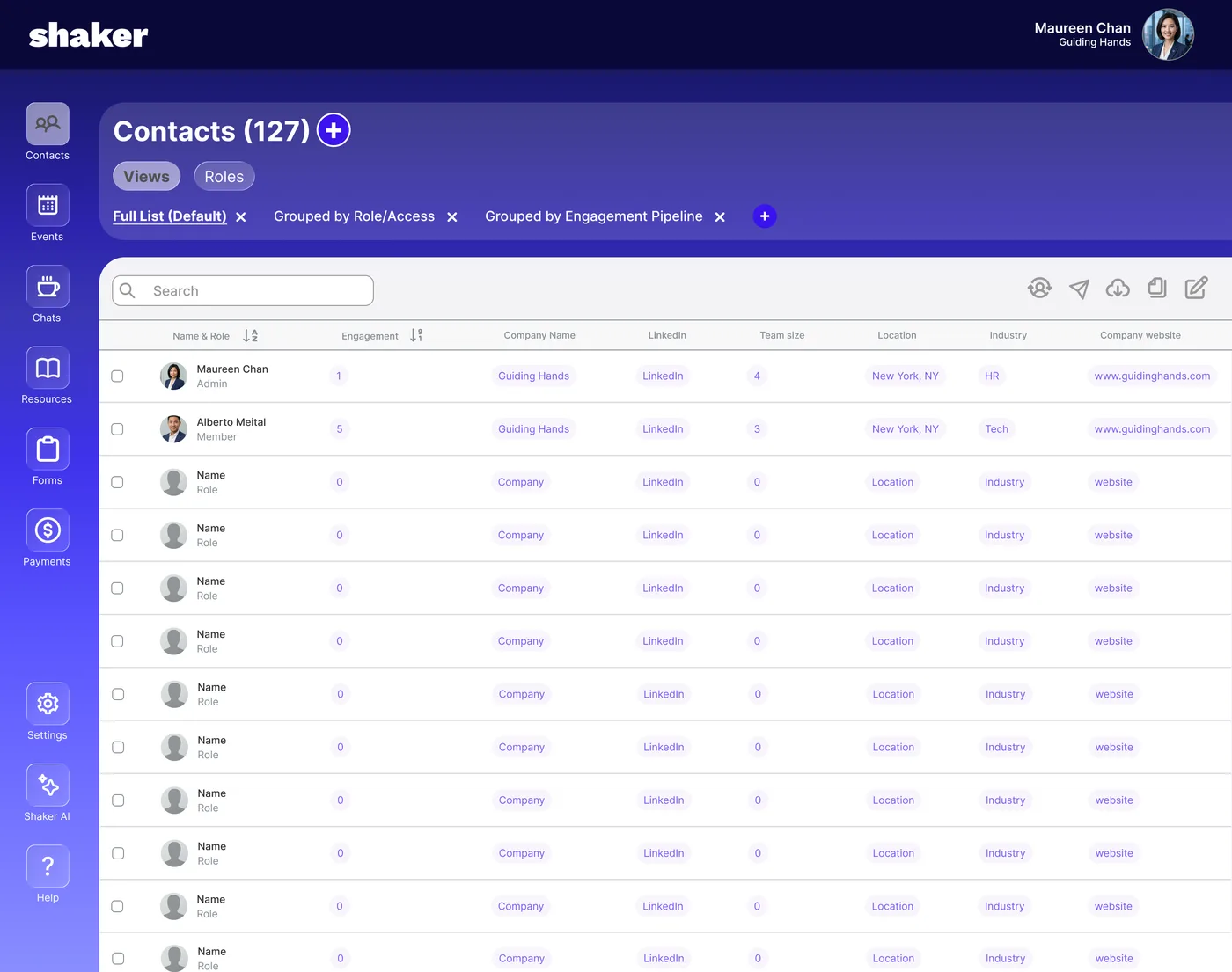
What testing showed: The Roles feature was hard to find, and role management wasn't intuitive.
What I changed: Among other UI adjustments, the role filter was folded into the views, so there's one place to change how contacts are grouped instead of two.
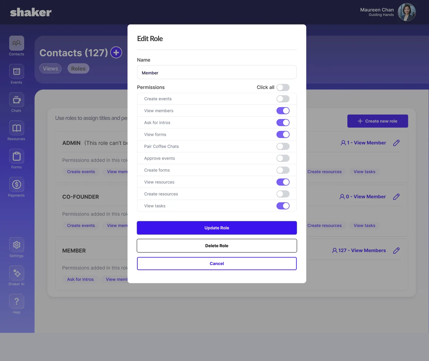
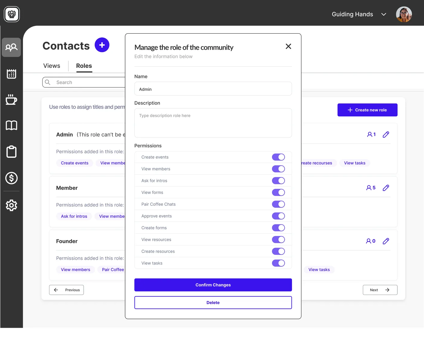
9. Changing Roles
Design reasoning: Roles are the hardest thing to picture in the product — an admin opens this screen to answer “what can this person actually do?”, and the editor needed to answer that at a glance.
What I changed: A simpler, more straightforward UI was introduced, stripping out extraneous elements. (Not yet validated with users.)
Results + Next Steps
During testing, users quickly grasped Shaker’s purpose, found the landing page to be clear and confidence-building, and navigated onboarding smoothly.
Future tasks with usability testing may include:
- Building out the full payment flow
- Expanded web copy
- Improvement of the accessibility of Roles and Views
Metrics
Key metrics include conversion rates and user retention over time. Using the following tools would be beneficial to install within Shaker behind-the-scenes, to track how often and deeply users engage with the platform; for example, average events attended per member per mo.

Heatmaps and session recordings identify where new users drop off during onboarding and sign-up.

Tracks A/B test landing page and pricing page variations to optimize demo-to-signup conversion.

Auto-tracks clicks and page views on new features without manual tagging, minimizing dev effort.

Baseline for tracking overall site traffic, user demographics, and engagement patterns. Works alongside the other tools to complete the full analytics picture.
Reflection + Closeout
Shaker’s edge is its all-in-one platform for specific types of professionals. With these updates that clearly communicate its value upfront, it has the potential to serve these users across every scale, from book clubs to large scale operations.
The biggest lesson was resisting the urge to jump into Figma before the research was solid. Keeping the team grounded in research meant our design decisions were defensible and our scope stayed realistic. Completing the MoSCoW and Feature Priority matrices were the turning point, giving both us and the client confidence in what we could actually deliver when it came to prioritizing the features to work on.
Timeline
A full list of completed tasks from the sprint
- Outlined group charter
- Reviewed client information
- Gathered feedback on handling the first client meeting
- Prepared questions for the meeting
- Drafted and sent client introduction email
- Met with clients and established the plan moving forward
- Scheduled follow-up meetings for the next week
- Outlined initial research steps
- Set up platforms (Slack, Shaker, Hotjar, Notion, Google Meet)
- Created Kanban board in Notion to plan the research phase
- Conducted heuristic analysis of Shaker
- Assigned leads and roles
- Began drafting user interview questions
- Set priorities for deliverables in Notion
- Conducted several interviews and scheduled additional sessions
- Reviewed usability test recordings provided by Shaker
- Completed all remaining interviews and transcribed insights
- Refined and repackaged heuristic evaluation, created supporting graphs
- Synthesized data and began building presentation slides
- Met with client to review progress and align on next steps
- Incorporated feedback to adjust design pillars
- Completed affinity mapping to produce “I statements”
- Prepared for design critique
- Completed design critique and reviewed next steps
- Finalized synthesis and early design work, including feature priority matrix and central feature pillars
- Assigned lead and support roles for each pillar to guide design development
- Dedicated full day to hi-fi design in Figma
- Scheduled weekend work to meet upcoming deadline
- Met with clients to provide progress update
- Incorporated feedback to refine hi-fi prototype for round 2 of usability testing
- Edited usability test script and launched second testing round
- Continued developing hi-fi prototype
- Conducted round 2 of usability tests
- Began preparing presentation and project report
- Finalized hi-fi design and transitioned to crafting presentation and project report
- Conducted multiple rehearsal run-throughs in preparation for final presentation
- Met with clients to deliver final presentation